Mobile Design
Breadswipe case study

Chris Donlevy - Donlevy Design
Scroll to Mockups
Scroll to Contact Form
Begin ID: Two screens of the BreadSwipe app. One is the branding, another is the menu where one can learn more about the bread they are buying. End ID.
The product
A mobile app delivery service for local bakeries.
Project duration
January 15, 2022 - May 15, 2022
The problem
Local bakeries often cannot afford or do not want to partake in delivery apps like Skip the dishes, due to the high commissions charged to the restaurants who use the service. As well, customers are put off by the business practices of delivery apps, and resist using them when the business is local.
The goal
To explore how to provide a delivery app that is transparent in how it makes money, and flexible in how it can provide fresh, local, high quality bread to users
My role
Chris Donlevy - Design Lead, Research Lead
Responsibilities
User research, wireframing, prototyping, user testing
Understanding the user
  • User research
  • Personas
  • User journey maps

User research: summary

User research for this project was primarily done through interviews. My interview participants were a mix of genders, with an age range of 25-45. They all live within Winnipeg, MB, Canada, and earn between 30K-80K a year in salary. All participants were white/Caucasian. Ideally I would have liked to include more folks of different races and of different abilities, however none of my contacts passed the screener that would have granted them an interview. Perhaps there is an exclusionary bias within my screener that caused this, and it’s worth reviewing.

One of my major assumptions was that users would universally dislike food delivery apps, yet view them as “necessary” given the safety such delivery provided them during the pandemic. These assumptions were challenged by a few participants who were great fans of delivery apps: this was especially true among participants who had busy schedules with work.
User research: pain points
1
Local bakeries are out of the way, and not easy or desirable to get to after the end of a long day.
2
Local bakeries are limited in their parking, preventing users from easily going on a whim.
3
Though users want to support local bakeries, doing so often means going far afield.
4
Food delivery apps are choking out local bakeries, but sometimes they are the only reasonable way to get bread from other bakeries.
Personas
Estelle Gardiner
Estelle is a busy bread lover who needs an easy way to procure fresh, high quality bread at the end of work: this is because they want to include it as a regular part of their diet.
Begin ID: An infographic of the persona doc for Estelle Gardiner. Link to text of document included below. End ID.
Ronnell Chambers
Ronnell is a socially conscious lover of bread. She needs a new remote method of buying from her local bakery, because bakeries are choked out by food delivery app comissions, and Ronnell wants to support a delivery app that works differently.
Begin ID: The Persona Doc for Ronnell Chambers. Text of this doc is linked below. End ID.
User journey maps
My goal with these user journey maps were to determine where a delivery app could intervene for the best unique value. A few discoveries include:
  • a “quick reference” guide based on allergens and diet preferences;
  • more powerful and quicker filter functions;
  • and deeper descriptions as to how the bread is made.
Begin ID: The User Journey Map for Estelle. Text will be linked below. End ID.
Begin ID: The user journey map for Ronnell. Text of this document will be linked below. End ID.
Starting the design
  • Paper wireframes
  • Digital wireframes
  • Low-fidelity prototype
  • Usability studies

Paper wireframes

These wireframes were a good way to explore a different manner of presenting products. I played around a bit with the “shelves of bread” look, and I may create a sort of AB test to see if it’s viable.

However the sketch that I decided to polish for this project was something of a standard product menu for delivery apps. I didn’t want to re-invent the wheel too much on this one.
Begin ID: A sketch of a screen for the Breadswipe app, demonstrating a card layout for the mobile view of the app. End ID.
Begin ID: A "Menu" layout for the Breadswipe app, designed to help users select food similar to a menu in a restaurant. End ID.
Begin ID: A Sketch of a "shelf" layout for selecting different bread (products sit on a vertical line, are tapped by user to peruse options. End ID.
Begin ID: a bottom drawer functionality for seeing info about the bakery and the bread the user wants to buy. There is a like button as well as pricing and general info. End ID.
Begin ID: More sketching around the Shelf look. End ID.
Begin ID: The layout I settled on for the main menu. I went with the "Menu" style look because the layout was validated in other food apps. End ID.

Digital wireframes

I played a lot with different states for this one. The material design “chips” were useful as a toggle for filters, and changing the color of them when they were enabled seemed to be pretty clear. As well, having a clear layout of accessibility symbols was useful - I thought 3 symbols maximum was a good starting point.
Begin ID: A wireframe of the main page. There are pills to indicate filtering, and card of a given bakery being shown. There are three squares labelled "accessibility symbols" on the right of the card. End ID.
This layout was meant to explore what a two-stage list might look like with the material design bottom drawer function. The user simply taps a button on the top right to access more info about a  product.
Begin ID: A wireframe of the bread description bottom drawer. There is text indicating the baking method, description of the bread, aroma, and what the bread is best paired with. End ID.

Low fidelity prototype

This user flow is designed to help users filter options of restaurants in order to get to one that meets their dietary and health needs quickly.

Usability studies

I conducted two rounds of usability studies with five people each (ten total). I found that there was a challenge in humanizing the delivery experience due to issues with privacy. These concerns were valid; having the information of bakers in the app did not re-create the “familiar feeling” of local bakeries, and also published info that could be compromising to the bakers. I switched to no names, picture or bio. Instead, I implemented “Bakery Vibes” in place of “Baker Bios”. This received a pretty good response. As well, switching from a filter function to a highlighting function alleviated the user panic of other bakeries seemingly being deleted.

Round 1 Findings
1
Discomfort with publishing the names of the bakers - explore anonymity.
2
Community bulletin board was not intuitive - explore other ways to show community events.
3
Filtering bakeries was not well received, Users thought bakeries were deleted - perhaps highlighting relevant icons of profile friendly bakeries may be a better, less obtrusive option.
Round 2 Findings
1
No real issues with anonymity given new implementation of “Baker Vibes” as well as removing photos of bakers.
2
Users did not mind linking out to webpage community bulletin board. Two participants asked if events were real.
3
Users preferred the highlighted icons as opposed to filtering the bakeries - felt their options weren’t limited, but rather guided.
Refining the design
  • Mockups
  • High-fidelity prototype
  • Accessibility

Mockups

Dietary Information

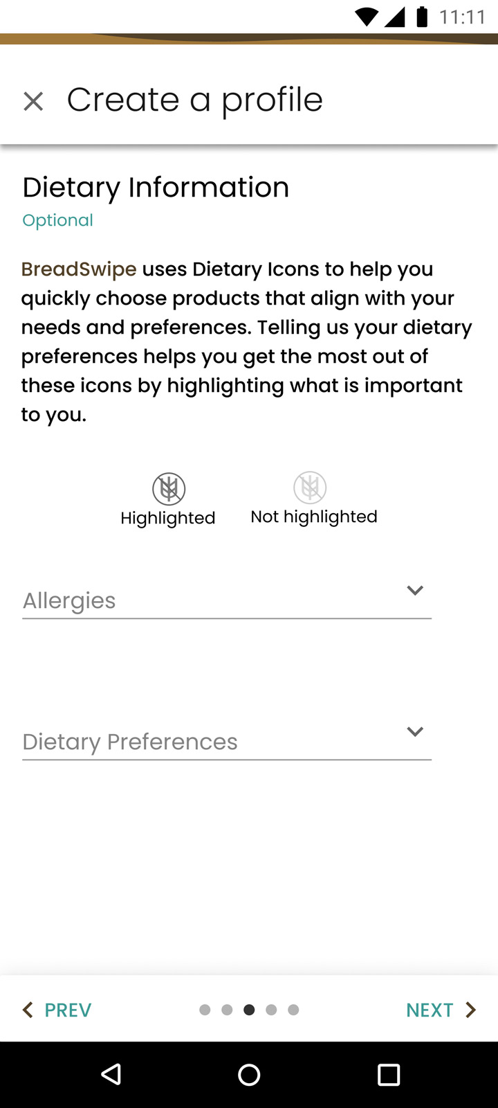
Before, the user had the option of filtering out bakeries by the parameters that they set in their profile. This panicked a few users, as they became worried that they wouldn’t be able to ever see those bakeries again. I replaced this function with a highlighting function instead, and simply reorganized the options from most profile matches to least.

Begin ID: The wire frame of the home page from before, with the filter pills and the card of a bakery. End ID
Begin ID: The high fidelity mockup of the create a profile screen. The screen is asking the user to input allergies, to better help the user sort through bread options on the app. End ID.Begin ID: A high fidelity mockup of the home page. The filter pills are still there, but the bakery cards are built out. There is a high resolution picture, estimated delivery time, and accessibility symbols along the bottom right indicating eggs, dairy, ad gluten. Some symbols are more opaque, indicating diets the bakery can accommodate. End ID.
Bakery Vibes

In an effort to build a feeling of connection with the local bakeries, I created baker bios. However, this understandably created anxiety about privacy - would bakers want to reveal personal details about themselves on a publicly available app? Turns out, of course not!

I switched Baker Bios to Bakery Vibes, where a general description of the things the bakers like is provided rather than specific details. The user still gets to know the bakers, without learning anything about one specific baker.

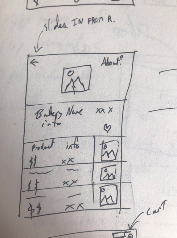
Begin ID: A wireframe of a screen where users could learn more about a given baker at a bakery. The screen says "Baker Name", "Bio", then grey lines to indicate further text, as well as a picture of the baker. End ID.
Begin ID: The high fidelity mockup for the "About" page. This screen includes a rating system for the Bakery, description of the bakery's "Vibes", and dropdowns where users can read more about the bakery's history, methods, and where they can view a community bulletin board. End ID.
Begin ID: The bottom drawer mockup, where users can learn about a specific loaf of bread's description, dietary accommodations, and aroma at a glance. Begin ID: The high fidelity mockup for the "About" page. This screen includes a rating system for the Bakery, description of the bakery's "Vibes", and dropdowns where users can read more about the bakery's history, methods, and where they can view a community bulletin board. End ID.

High-fidelity prototype

Click or tap the link below to try the prototype.
High Fidelity Prototype

Accessibility considerations

1
Accessibility icons
Accessibility icons allows users to make important choices for their health and well-being.
2
Contrast, font weights, and color blindness
Strong contrast ratios and font weights in text for both light and dark mode; considerations made for those with all forms of color blindness and low vision.
3
No swiping gestures
No swiping gestures are needed to navigate the app, and the app is optimized for screen readers.
Going forward
  • Takeaways
  • Next steps

Takeaways

Impact

In the second round of testing, I was happy to find that all of my users wanted the app to be real. One user went so far as to say that they would “want to work for the the company that made this app”. Generally, users were pleased at the efforts in accessibility icons/symbols, but for a surprising reason: at a glance, users were able to see if a product was something they had never tried before. This created an unintended, but welcome explorative element in the app.

Begin ID: The BreadSwipe Logo. End ID.

What I learned

I learned, first, that bread is a unifying strand through many different backgrounds. I also learned the value of iteration in finding unique value propositions - my competitive audit revealed where I could focus to add value and utility to my application, and was responsible for the creation of the accessibility icons. Finally, and this is especially important, I feel like I really improved in my interview technique this time around. I provided few (if any) leading questions, and was rewarded with many insights from my interviewees. My interviews seemed to encapsulate two insights: let people speak, and share the load. Though this was a solo project, I felt like I had a strong team around me due to how generous the participants were with their insights and time.

Next steps

1
Delivery tracking
Exploring the delivery tracking function, and finding ways to bring local flare and accessibility into that as well.
2
Ad-based revenue models
Researching ad-based revenue models, and exploring whether they are conceivable for delivery apps - this is a possible solution for the crushing commission charges other food delivery apps enforce.
3
More interviews with bakeries
Conduct interviews with bakeries, gain further insight into behaviors, motivations, and pain points into bakery side of bread delivery.

About Chris

I am a UX/UI designer who’s been in the Design world for three years: I originally joined the UX/UI world because the opera industry was shuttered due to Covid-19, and I had always been fascinated with tech. I’m so happy I joined this industry; I have loved helping, serving, and sharing ideas with people, and UX/UI design has been a wonderful way to do this. I’m excited to see what the future brings, and who I can help next.

Photo ID: Chris Donlevy's headshot. He is wearing a blue plaid shirt.